
A poster assignment tests something genuinely different from an essay — combining oral, visual, and written communication into a single page that has to work instantly, from a distance, without you standing there to explain it. Many students treat it as “an essay squeezed onto a page” and lose marks because a poster with too much text simply doesn’t communicate. Here’s how to actually design one well.
Start With the Message, Not the Design
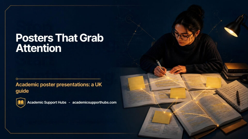
Don’t open PowerPoint first. Decide on one clear main message and the handful of steps needed to communicate it before you touch layout or colour. A useful planning method used across UK academic skills guides: write your content on post-it notes of different sizes, representing blocks of text and images, then physically move them around to find a logical sequence before you build anything digitally. (See the University of Exeter’s own guide to academic posters for more on this planning method.)
Structure: The Three-Levels Model
Most effective posters use three distinct visual levels — title, sub-headings, and body content — each with a different size, and ideally different weight or colour, so a reader can navigate the poster at a glance without reading every word. Structure your content under sub-headings that mirror what you’d use in a longer piece of work (introduction, methods, results, conclusion, for example), rather than one unbroken block of text.
Your Title Does More Work Than You Think
A flat, purely descriptive title gets skipped in a room full of posters. Compare a title like “A microstructural study in the alumina zirconia system” against something like “Ceramic hip joints: better for you than titanium?” — the second version raises a real question and pulls a reader in, without sacrificing accuracy. Your title is often the only thing a passing reader sees before deciding whether to stop.
Font, Size, and Readability Rules That Actually Matter
- Minimum body text size: 24pt for a standard A0/A1 poster, with headings at 48pt or larger — smaller posters (A3) can go as low as 14pt, but always check your specific size and format
- Use a sans-serif typeface (Arial, Calibri, Verdana) — these read more clearly from a distance than serif fonts
- Stick to one or two typefaces maximum — more than that reads as visually chaotic, not sophisticated
- Left-justify body text — easier to read than centred or justified text
- Avoid italics for body content — they’re measurably harder to read, especially at a distance
- Use bold or larger fonts to emphasise key points, not italics or underlining
Colour and Contrast
Choose a deliberate, limited colour scheme rather than defaulting to whatever looks bright — a colour wheel tool can help you pick genuinely complementary colours rather than ones that clash. Contrast matters more than most students expect: always ensure strong contrast between text and background, and specifically avoid combinations like red text on a green background, which are difficult for readers with colour vision deficiencies to distinguish. Free online contrast checkers exist specifically for this.
Word Count and White Space
Word limits vary and aren’t always fixed, but a genuinely common guideline for a standard A1 poster is around 1,000 words — sometimes less if you’re printing at A2 or A3. Critically: don’t treat empty space as wasted space. A well-designed poster deliberately includes white space, since it’s what makes dense visual content actually readable rather than overwhelming.
Images, Charts, and Visual Elements
A relevant chart or diagram communicates far more efficiently than a paragraph describing the same data — don’t be afraid to let visuals carry weight that text would otherwise have to. Whatever you include, use high-resolution images; pixelated or blurry graphics undermine an otherwise strong poster instantly and read as careless.
Don’t Forget the Practical Basics
- Include your name, institution, and contact details clearly, especially if the poster will be displayed publicly
- Leave adequate margins (commonly at least 1.5cm) to avoid content being trimmed when printed
- Set your page size correctly from the start — configure for the largest size you might need, since scaling down is far easier than scaling up
- Check your specific institution’s template or brand requirements if one is provided — many UK universities have their own poster templates and expect you to use them
Proofread It Like Any Other Piece of Work
A poster with a single visible typo undermines credibility disproportionately, precisely because there’s so little text — every word carries more weight than it would in a full essay. Proofread carefully, and ideally get a second pair of eyes on it before you print or submit, since errors are much harder to fix once a poster is physically printed.
How ASH Helps
Even a visually strong poster needs precise, clear writing — every sentence has to earn its place in a genuinely limited space. ASH’s editing service checks clarity and conciseness in exactly this kind of high-stakes, low-word-count writing, alongside the language corrections covered in our guide to why international students lose marks for English in the UK.
If you want your poster text reviewed before you finalise the design, message ASH on WhatsApp:
👉 Chat with ASH on WhatsApp: +92 313 1624960
(This WhatsApp number is ASH’s official business line.)
Related Guides
- How to Write a UK Dissertation Abstract
- Oral Presentations: A Survival Guide
- Understanding UK Assignment Briefs
- ASH Assignment Guidance Services
FAQs
What font size should I use for an academic poster?
For a standard A0/A1 poster, at least 24pt for body text and 48pt or larger for headings. Smaller poster sizes can use smaller text, but always confirm your specific format’s requirements.
How many words should an academic poster contain?
There’s no universal fixed limit, but around 1,000 words is a commonly used guideline for a standard A1 poster — less if printing smaller. The real goal is clarity and readability, not hitting a specific count.
Should I use serif or sans-serif fonts?
Sans-serif (Arial, Calibri, Verdana) — these are more legible from a distance, which matters for a poster meant to be read across a room.
Is white space really necessary, or is it wasted space?
It’s necessary. A well-designed poster deliberately includes white space, since dense, unbroken content becomes overwhelming and harder to read, regardless of how good the individual content is.
Want your poster text reviewed before you finalise the design? Message ASH on WhatsApp: +92 313 1624960.